
Spring Into Style: Three Colour Combinations to Try This Season
Don’t underestimate the power of pastels.
With spring officially in full bloom, we’re looking forward to longer days, warmer temperatures and — you guessed it — bright and colourful outfits.
If you’re anything like us, your favourite part of the winter-to-spring transition involves refreshing your wardrobe with all the light and refreshing hues that you didn’t wear as often in the cooler months. Just as we usually opt for darker, warmer tones for fall and cooler hues in winter, spring colour palettes typically feature an array of bright and fresh colours — think pinks, blues and greens — that complement the lush season.
We know what you’re thinking: Pastels for spring? Groundbreaking. But there’s a reason why we keep coming back to those soft and serene shades every year. Not only are they calming and pretty, but they’re also said to inspire feelings of optimism and hope, which are synonymous with the season of rebirth.

But we get it, sometimes it is possible to have too much of a good thing, and if a full-on, head-to-toe pastel moment isn’t your vibe, we’ve got you covered.
This year, contrast is the name of the game. On the Spring 2025 runways, countless designers played with pastels by pairing soft and colourful tones with neutrals like beiges, greys, blacks and browns. Others juxtaposed lightness with deeper and darker shades. The result? Springtime outfit inspo that’s not only chic and on-trend, but totally wearable for any everyday look.
Read on for our three of our favourite colour combinations for Spring 2025.
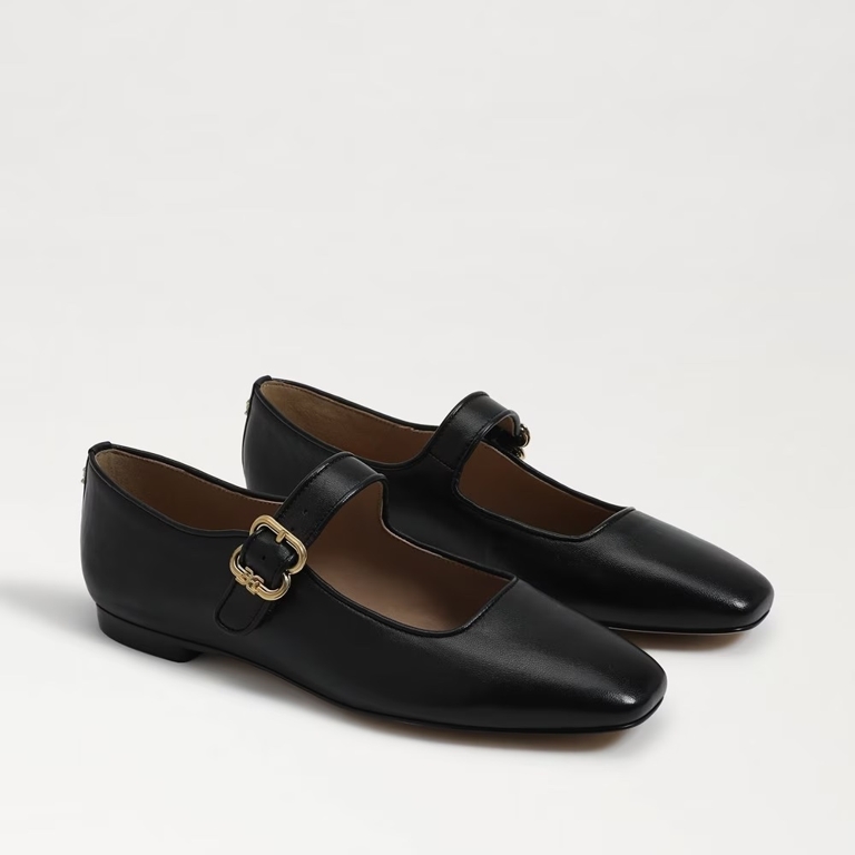
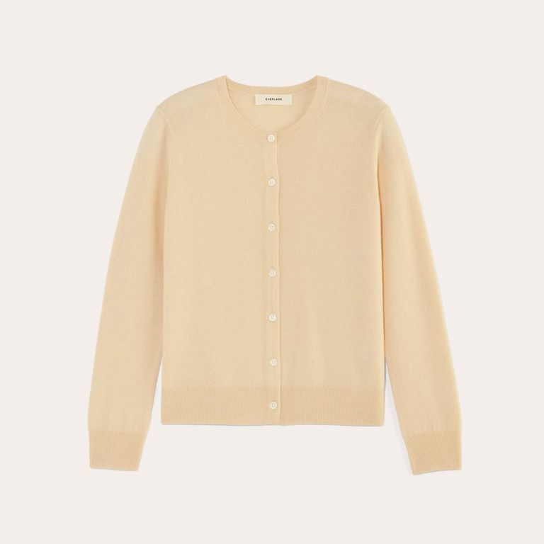
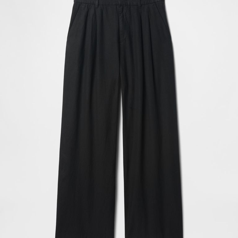
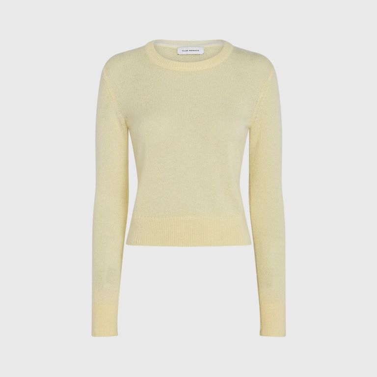
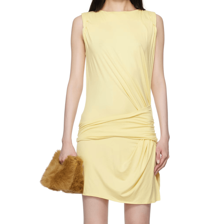
Butter Yellow and Black
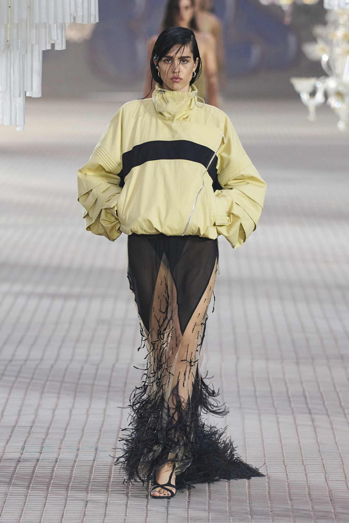
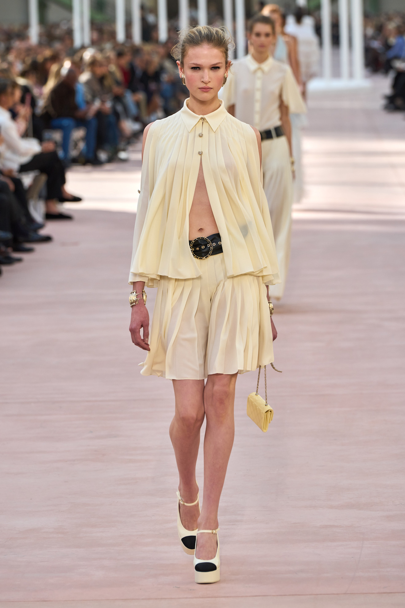
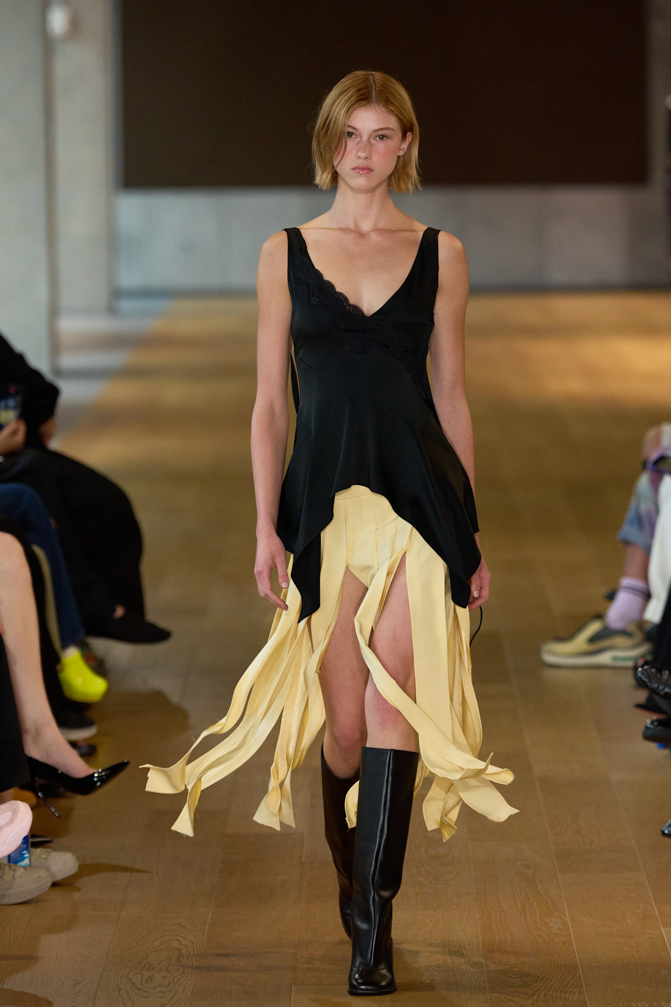

Chanel / PHOTOGRAPHY COURTESY OF LAUNCHMETRICS/SPOTLIGHT
Starting off strong is this season’s coveted butter yellow shade. This creamy colour has been in the trend cycle for a few seasons, but this time, we’re seeing it paired with classic black. Now, if you’re hesitant to try out this colour combination because you think it’s too bumblebee-adjacent, you aren’t alone. We hear you. But fear not: this delicious soft hue is a true pastel, drawing a clear distinction between in-style and insect-inspired. The contrast between black and sunny yellow lends an air of lightheartedness to any springtime outfit.
SHOP NOW
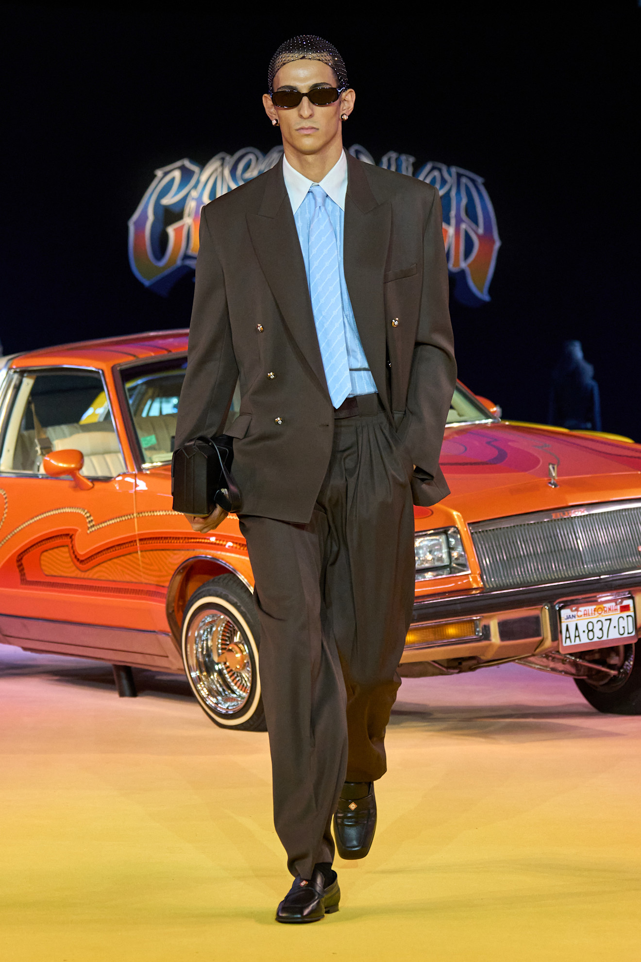
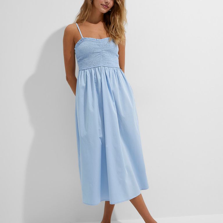
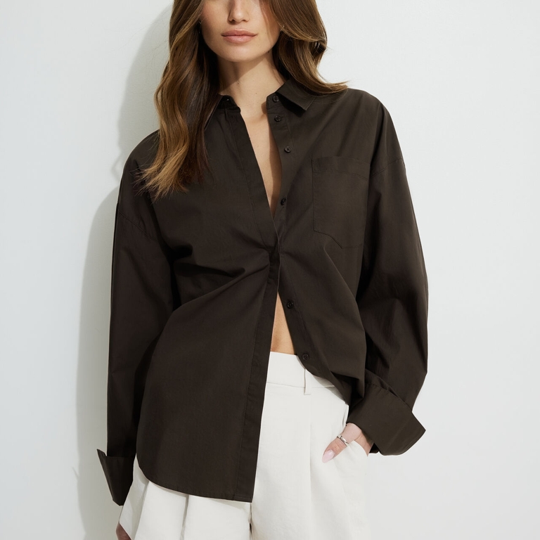
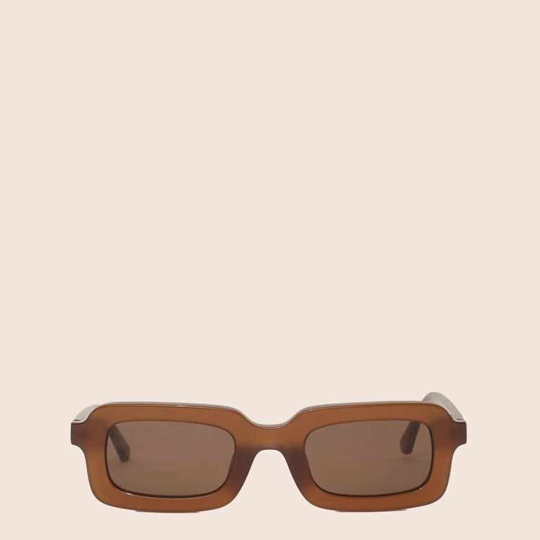
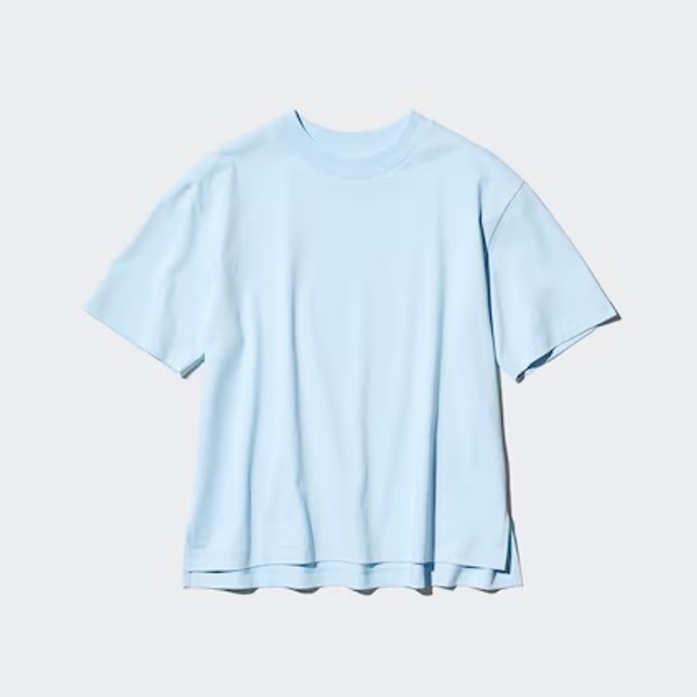
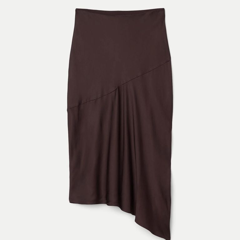
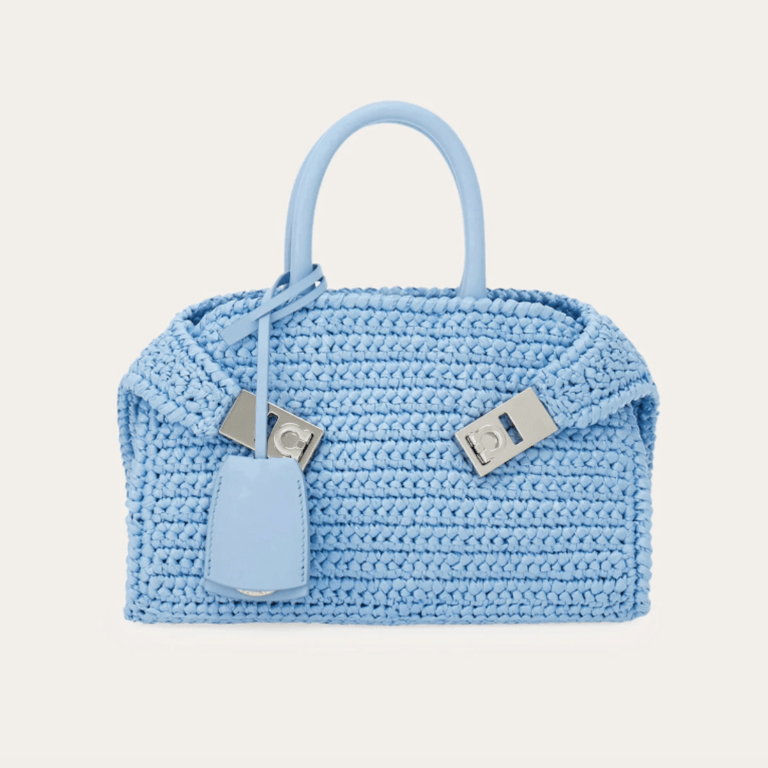
Baby Blue and Chocolate Brown
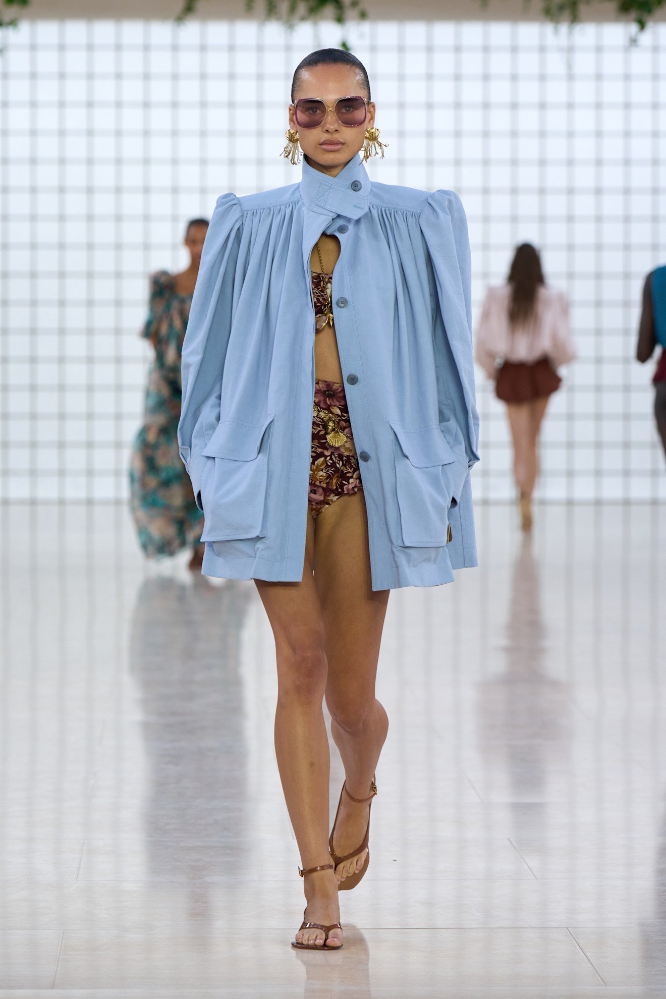
Chloé / PHOTOGRAPHY COURTESY OF LAUNCHMETRICS/SPOTLIGHT
Ah, baby blue. Even just saying the serene shade’s name aloud evokes a feeling of serenity — that’s partially why the hue is the perfect springtime colour. Its light, peaceful nature evokes memories of clear skies and fresh flowing water, two staples of a lovely spring day. Combine it with the warmth of a deep, chocolate brown for an effortlessly elegant, dichromatic outfit.
SHOP NOW
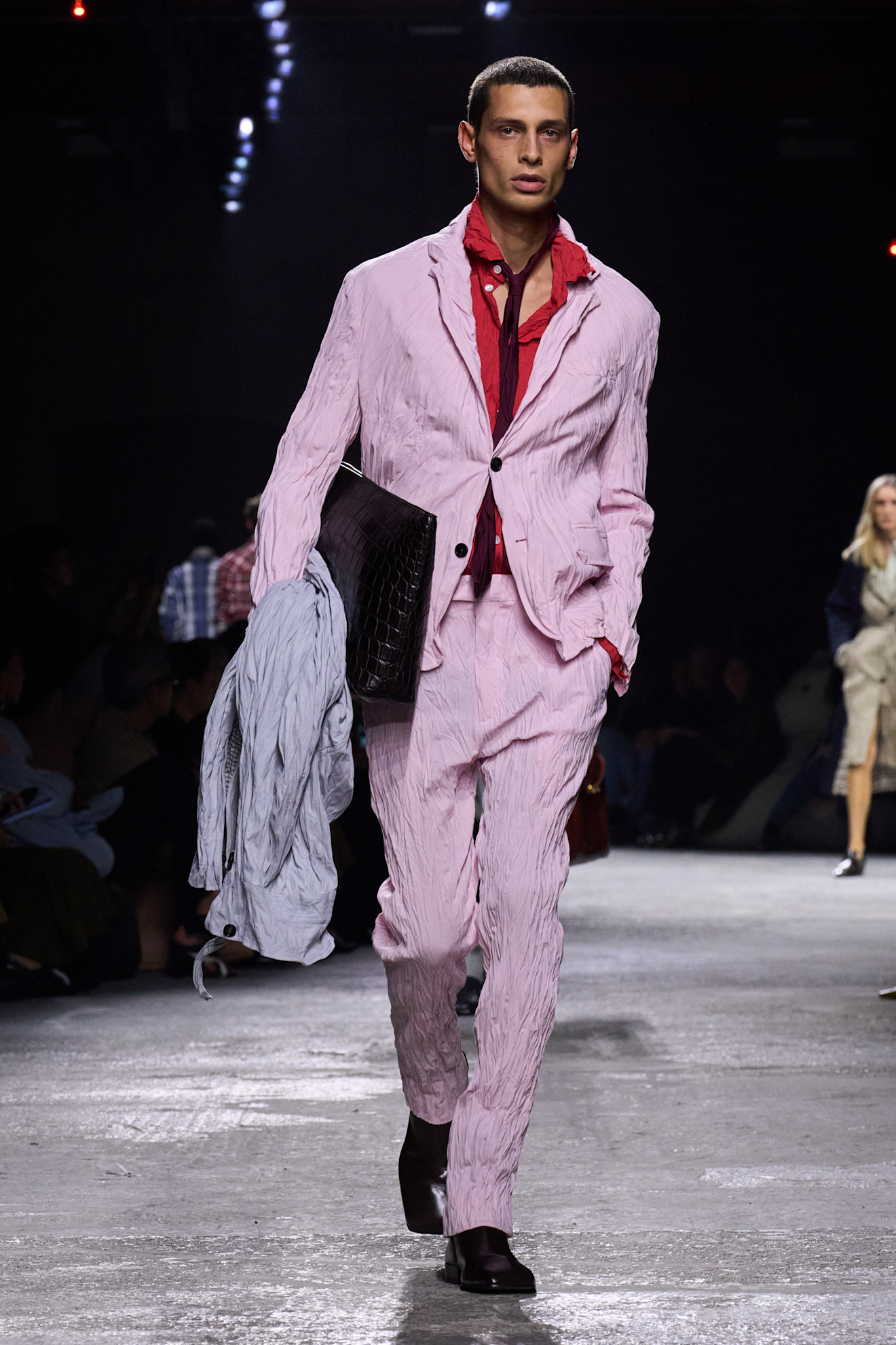
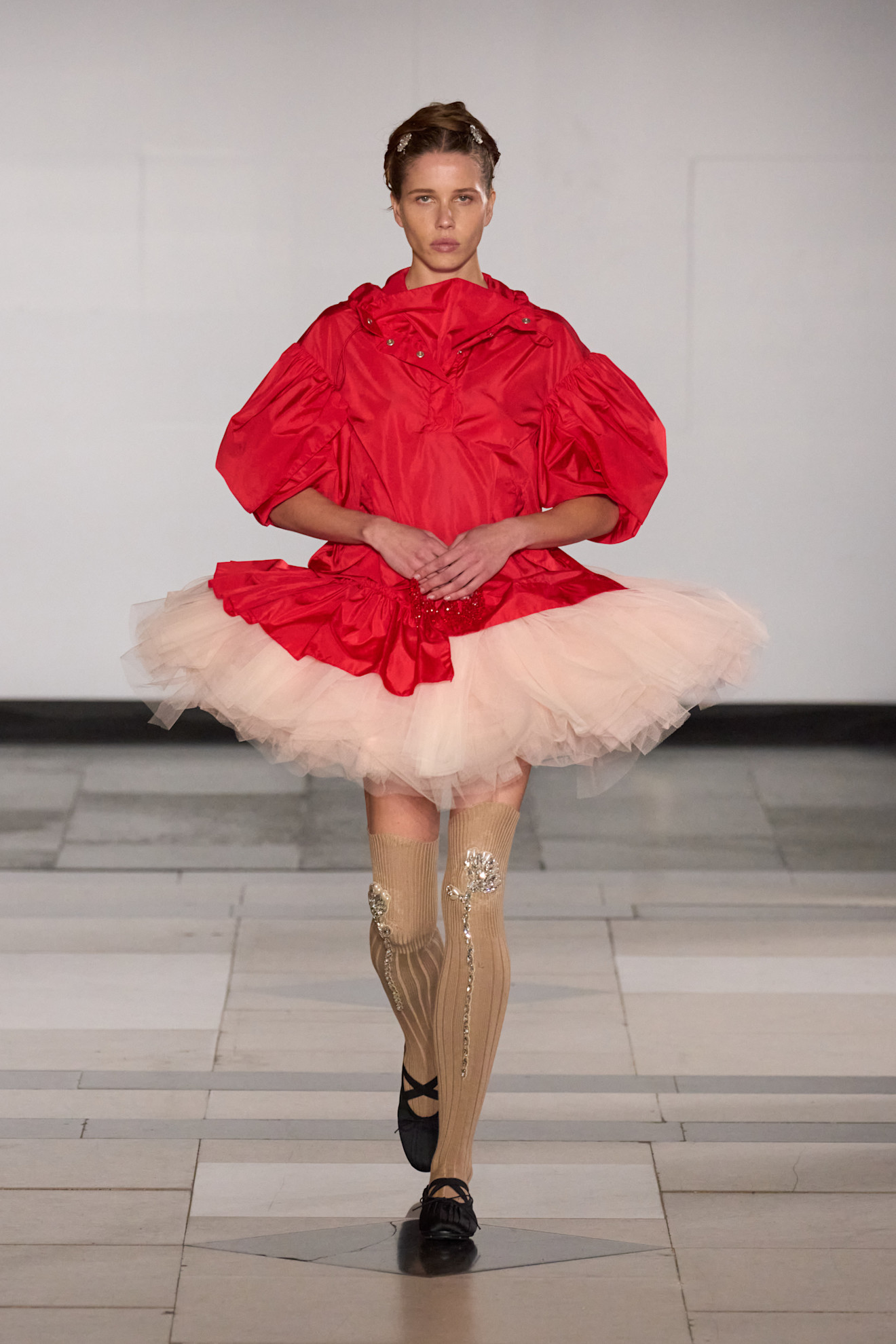
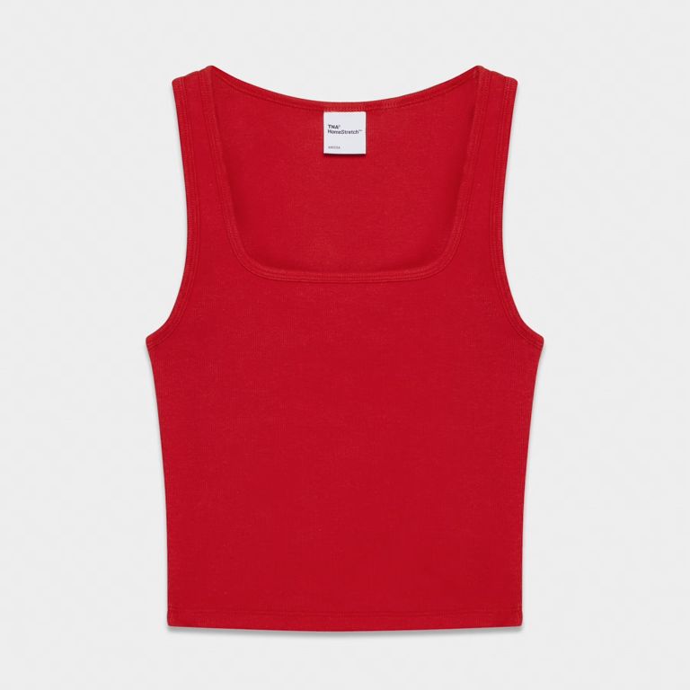
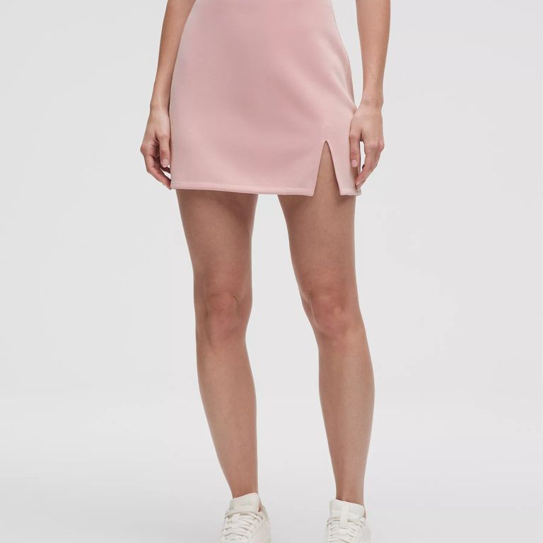
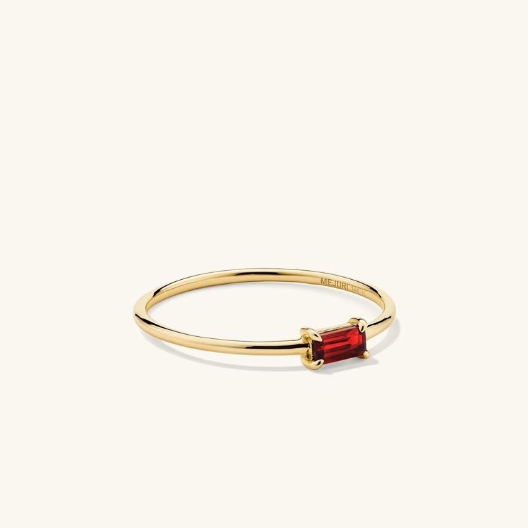
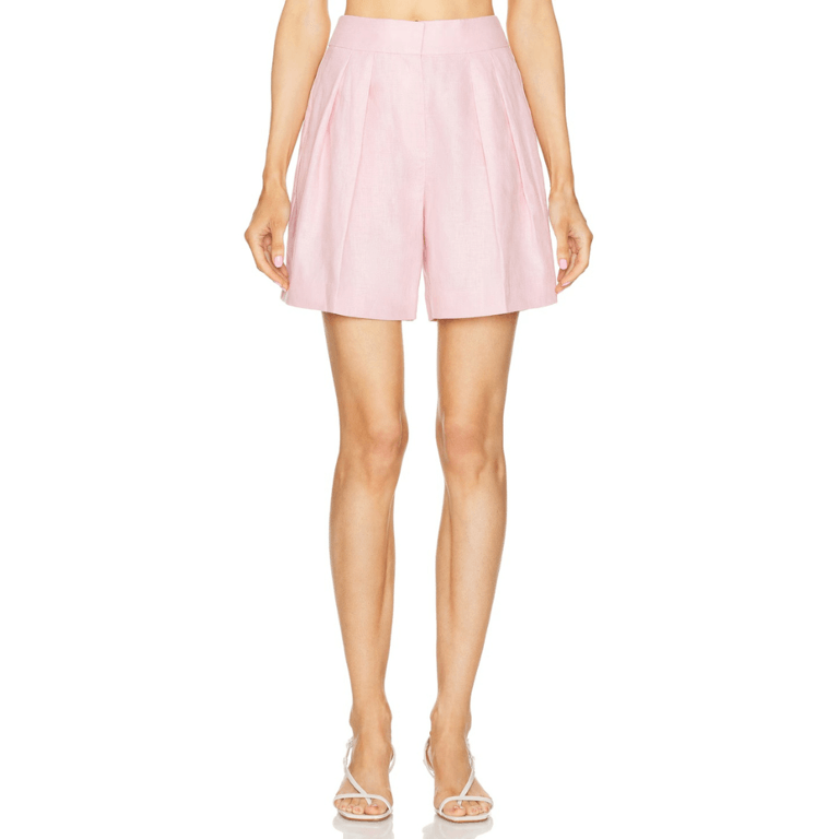
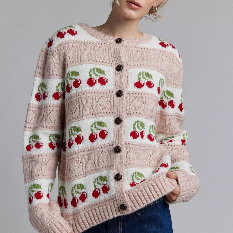
Pale Pink and Cherry Red
N°21 / PHOTOGRAPHY COURTESY OF LAUNCHMETRICS/SPOTLIGHT
If there’s one colour that positively screams “Spring!" it has to be the quintessential pastel pink. The gentle colour is not only a reminder of a blooming primrose, but it’s also linked to the overall warmth that encapsulates the beginning of spring. And don’t even get us started on cherry red — dubbed the colour of the season for good reason, it’s punchy, nostalgic and oh-so striking. Whether you’re more drawn to a deeper version of the popular red shade or prefer its lighter, brighter counterpart, all variations of the fruity tone provide a romantic and playful balance when contrasted against a delicate pale pink.
SHOP NOW
This article contains affiliate links, so we may earn a small commission when you make a purchase through links on our site at no additional cost to you.

Stephanie Davoli is the editorial assistant at FASHION Magazine. With a passion for all things fashion, beauty and pop culture, she’s inspired by fashion psychology, sustainability and industry innovations. Her previous bylines include The Toronto Star, Chatelaine and The Quality Edit. When she’s not working, you can find her shopping, taking a Pilates class or combing through the Vogue archives.