Riccardo Tisci Is Already His Leaving His Mark on Burberry’s Visual Identity
Riccardo Tisci’s era at Burberry has begun, signalling an era beyond the reign of checks and tartans. The newly appointed creative officer won’t debut his first Burberry collection before September, but he’s giving us a taste of what he plans to do with it. Tisci’s first rebranding strategy consists of an overhaul of the brand’s logo and monogram pattern, establishing a new — paradoxically vintage — visual identity in tune with the current craze for logos.
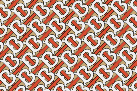
The logo used to be an all-caps serif-style created in 1999 (at the same time the brand dropped the ‘s’ from Burberrys) and graphic designer Peter Saville reimagined it as a sans-serif bold text. The monogram pays homage to the house founder, Thomas Burberry, with the interlocking TB beige, white and orange pattern, derived from a 1908 monogram. Saville is no stranger to the need for fashion houses to rebrand their image. Indeed, in 2016, the newly-appointed artistic director at Calvin Klein, Raf Simons, reached to Saville asking him to create a new logo. Saville’s long list of collaborations also includes designing a collection with Paco Rabanne and directing campaigns for Yohji Yamamoto and Jil Sander.
Now, to wait and see what new elements Tisci will infuse into his first collection for the brand.


 and graphic designer Peter Saville reimagined it as a sans-serif bold text. The monogram pays homage to the house founder, Thomas Burberry, with the interlocking TB beige, white and orange pattern, derived from a 1908 monogram. Saville is no stranger to the need for fashion houses to rebrand their image. Indeed, in 2016, the newly-appointed artistic director at Calvin Klein, Raf Simons, reached to Saville asking him to create a new logo. Saville’s long list of collaborations also includes designing a collection with Paco Rabanne and directing campaigns for Yohji Yamamoto and Jil Sander.
Now, to wait and see what new elements Tisci will infuse into his first collection for the brand.
iframe.instagram-media { position: static !important; })