For the first time ever, 2016’s Pantone Colour of the Year is a blend of two shades

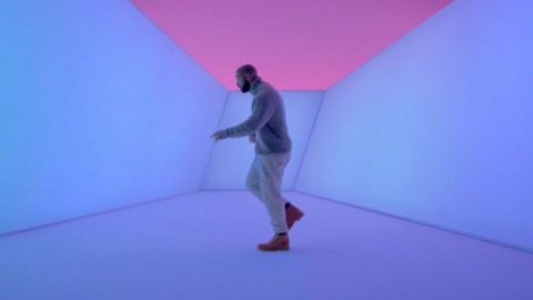
It’s a big day for uh, colours. For the first time ever, the Pantone announced its Colour of the Year would actually be two colours: Rose Quartz and Serenity. Well technically, a blending of the two pastel shades. While in previous years we’ve seen punchy and bold tones (Radiant Orchid in 2014 and Marsala in 2015) getting the honourable title, this year the colour institute decided to soften the palette and looked to pop culture for inspiration.
“With the whole greater than its individual parts, joined together Serenity and Rose Quartz demonstrate an inherent balance between a warmer embracing rose tone and the cooler tranquil blue, reflecting connection and wellness as well as a soothing sense of order and peace,” said Leatrice Eiseman, Executive Director of the Pantone Color Institute™. “Additionally, we are experiencing a gender blur as it relates to fashion, which has in turn impacted color trends throughout all other areas of design, opening our eyes to different approaches to color usage.”
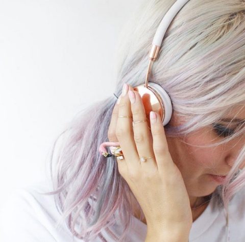
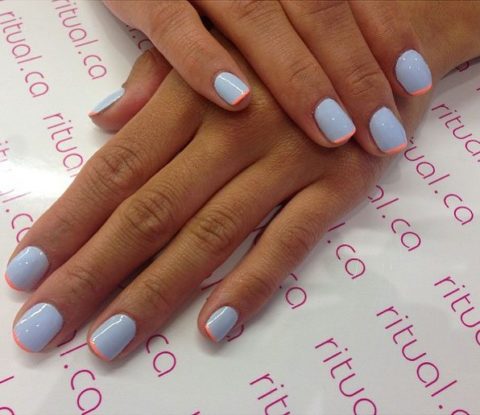
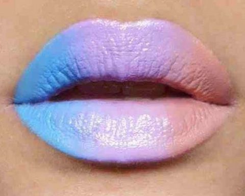
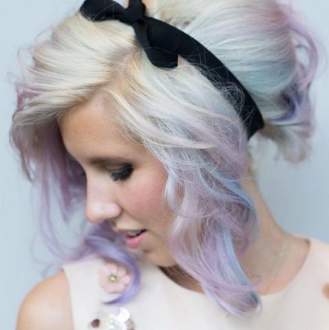
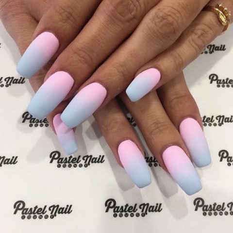
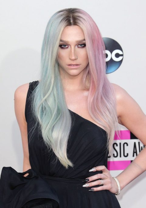
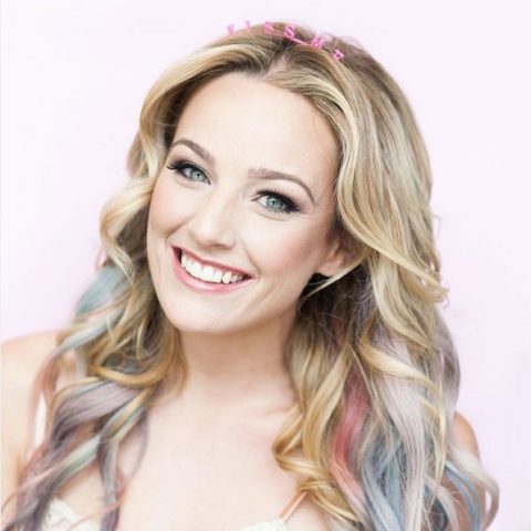
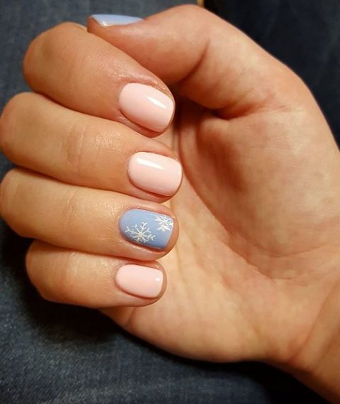
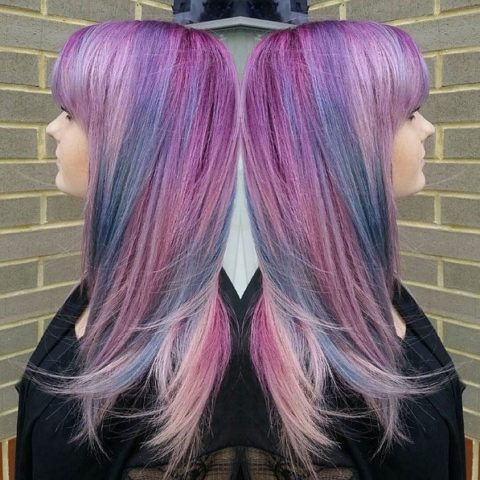
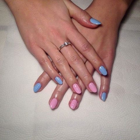
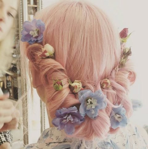
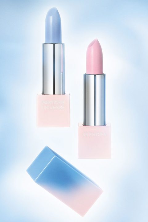
Aside from purchasing the watercolour inspired beauty products courtesy of Sephora and Pantone Universe (available at Sephora stores and at sephora.ca later this month), want to figure out how you can get on top of the pastel trend asap? From Ke$ha’s two-tone hair to Instagram-worthy manicures, we’ve rounded up 11 ways to incorporate the pink and blue shades into your beauty routine right now.

